


The following work samples are a collection of work, including freelance work done over the past several years. Other work samples are available upon request.
Note: some examples have been recreated due to confidentiality.
I designed this enterprise site to communicate product information that could be used as selling points in customer proposals. Previously this was rarely done in this engineering-focused company. This became a template that was used for other products.
Challenge: The application relied on over 70 enterprise services, many of which were down at any given time. Users complained about reliability and application usage was decreasing. Users encountered failures after attempting many tasks.
Research: I collaborated with service providers across the enterprise to raise the priority of fixing reliability issues and determining what was technically possible to show status. Interviewed users to determine labels for services in their terminology rather than system code names. I discovered that users were often confused by help desk emails that came out about issues.
Design: I designed a simple toolbar icon that changed color if any services were down or degraded that dropped down for details. The design included a configuration screen so users could configure the display to only show status for services they used. I also created an operating procedure and email templates for the help desk to use when system outages occurred.
Outcome
• Fewer calls to the help desk.
• Increased application usage based on analytics.
• Fewer failed tasks based on usability tests.
• Clear and consistent help desk emails.
I designed these inline table controls for a Windows desktop application. They enabled users to rapidly triage (confirm, deny) large volumes of records. Users simultaneously validated against the content of the record outside the table (master/details pattern). Users were also able to quickly scan the table to determine the current state of confirm/deny for previously triaged data. I’ve used this pattern several times since rather effectively.
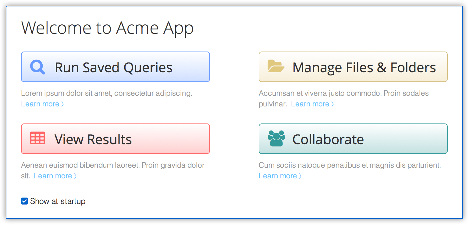
Challenge: The product was a powerful tool made for experienced users, most of which used the tool full-time every day. But it was overwhelming for new users.
My Role: Improve the initial experience for new and existing users by designing a welcome page to help them get started.
Outcome: Usability tests concluded that new users had a pleasant initial experience and understood key functions and areas of the application. Existing users used shortcuts to perform tasks more efficiently and could turn off the screen if they wanted. The page eventually expanded to include other useful functionality that made additional quick actions possible.
User observations, interviews, contextual inquiries, and analytics led to this work product. This is a result of collaboration from 2 UX colleagues.
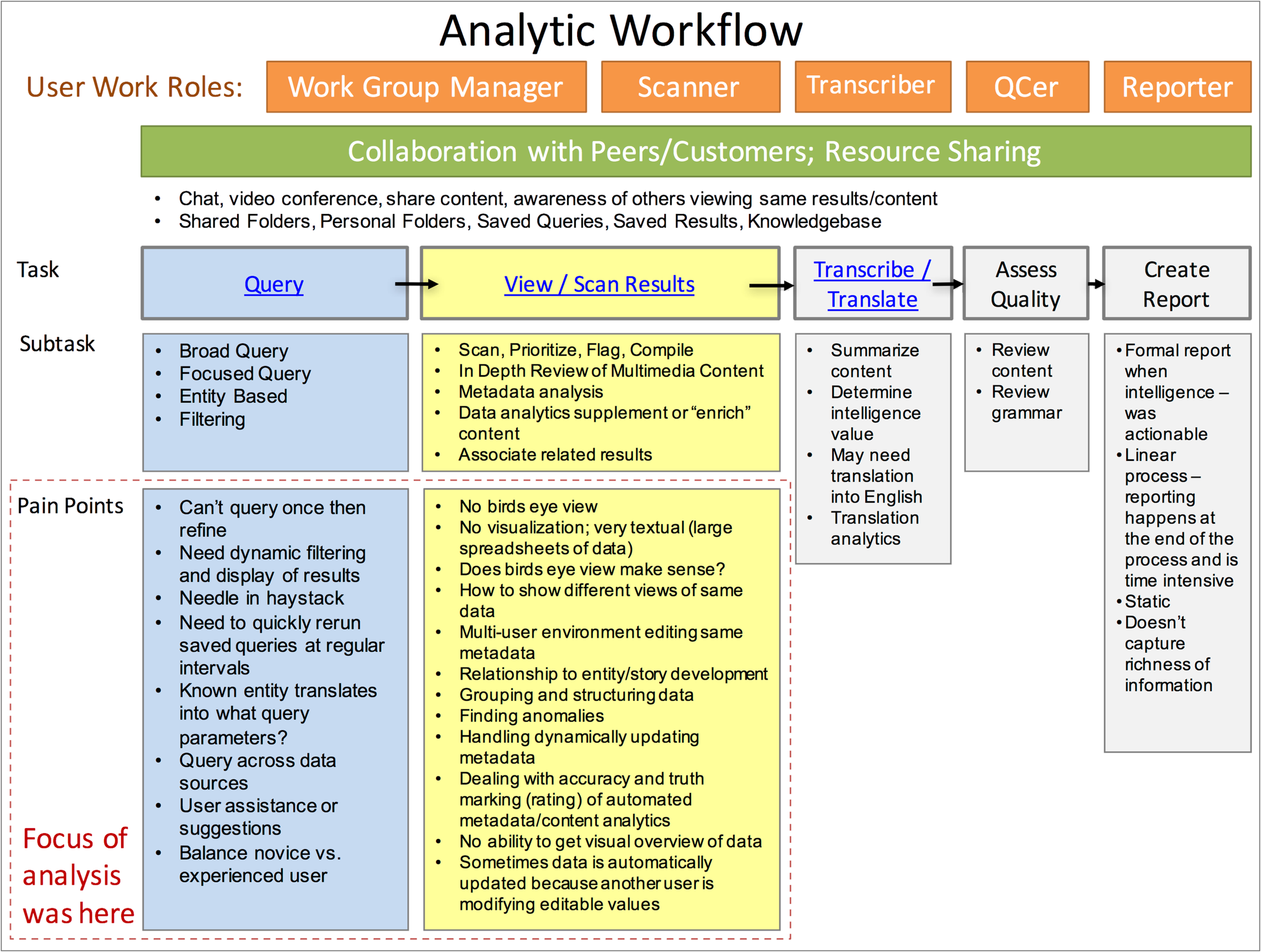
Challenge: Several organizations were involved in a complex business process that spanned multiple applications and offline processes. Roles and responsibilities weren’t clearly understood.
My Role
• Analyzed the “as is” process to identify what worked.
• Interviewed stakeholders to hear their perspective.
• Provided recommendations for an optimized flow.
• Decomposed processes on other charts.
• Represented process steps in vertical swim lanes.
Outcome: The process flow was a powerful communication tool to help reach understanding and consensus. Organizations had a better understanding of their roles in the horizontal swim lanes.
After meeting with my client to understand their vision for their personal training brand, I started by drawing a few logo ideas in the iOS Paper app. Then imported them into Sketch and generated ideas from there. I went through a few rounds of presenting ideas to the client to get their feedback. I then introduced color in the final set of options.
This is the final logo that my client loved, shown working on both a light and dark background, for him to use in a variety of mediums from online to apparel.